Here, Paul will discuss and show some of his photography.
More colour variations at Shugborough
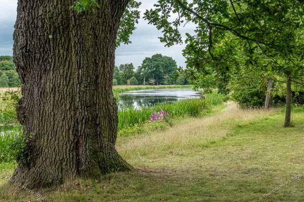
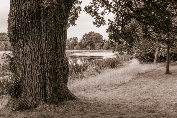
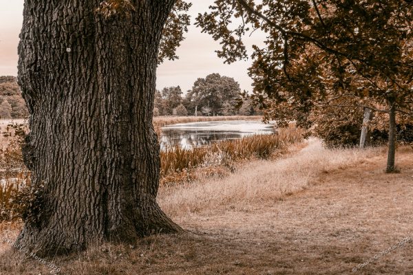
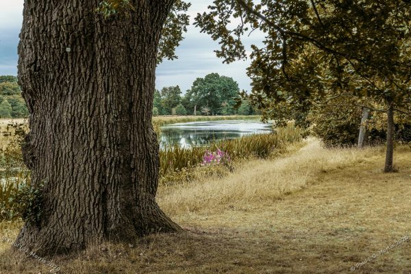
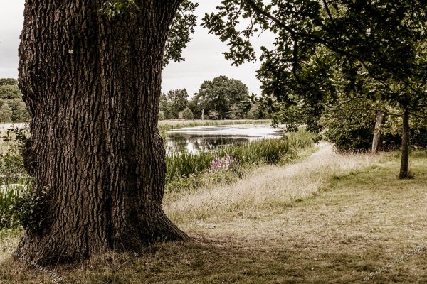
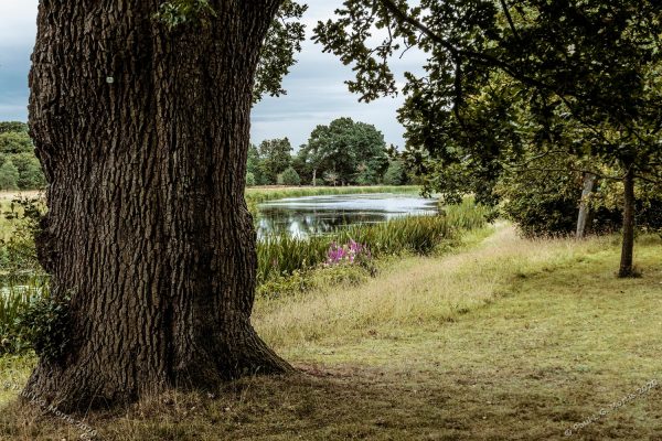
I tried more of my colour variations on images I shot at Shugborough last week. It was interesting in that a couple of the photos I tried them on just didn’t work – you may say all of them don’t work but it is a style I am developing. So here is this post’s set:
This is the original – I like the spot of colour in the centreThis is sepia toned. With hindsight I think it may have benefited from a little vignetting.This is what I call a copper wash…This is the first vintage colour effect with subdued green in the grass and reeds (but not the trees!)This is the second vintage colour with most of the tones subdued but with higher contrastThis 3rd vintage colour appears to be part way between the original and the first vintage colour
As I have said before, this is a matter of personal preference – there is no wrong or right about it.
Author: Paul L.G. Morris
I am an amateur photographer whose photography is mostly of gardens, nature and the rural environment. My specialities are close-ups, panoramic views, or a combination of both that I call 'Nearscapes'. I work mostly for my own interest having closed my business PM Studios Ltd.
View all posts by Paul L.G. Morris