Last week we went to the National Trust site at Shugborough. Although I took a few photos that were pleasant enough, I thought it would be interesting to play with the colours to see if they could be improved upon. Some of these worked better than others…
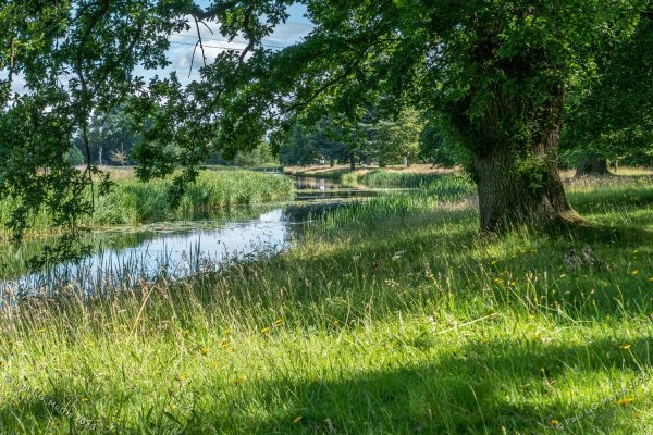
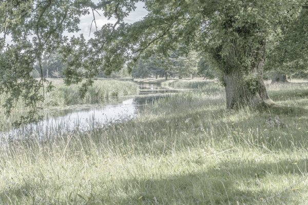
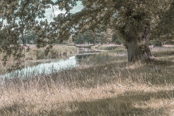
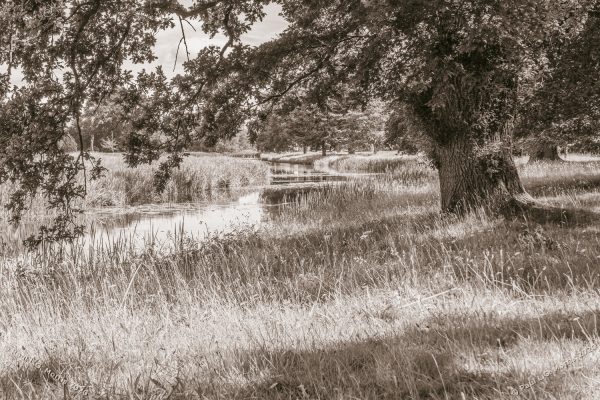
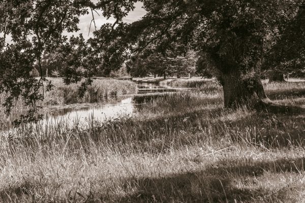
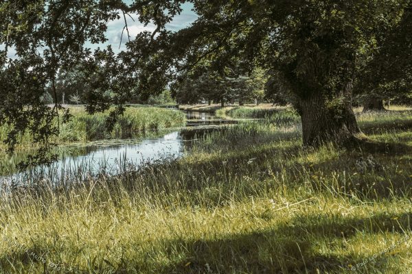
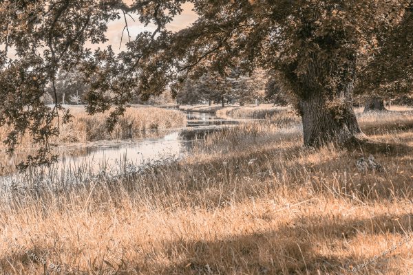
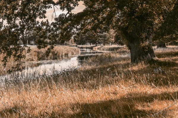
All-in-all, I found this a useful exercise. In building the colour effects myself I have learnt a lot about Photoshop and may have developed what could be an unusual method of achieving these effects – much better than copying what someone else has done.
I have kept the Photoshop file so I can use them as a basis for further experiments – these effects suit some images better than others. And, of course, much depends on the context the image is used in.