In a previous post earlier in the month: Infra-Red to Colour: A Comparison View I showed a comparison of a panoramic view using normal colour and infra-red views. I have now processed a second set of images that gives a variety of comparisons using the before-after slider technique.
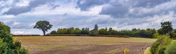
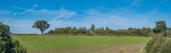
First the 2 colour images, the first from the previous post, the second a more recent view:
This gives a side-by-side slider comparison:
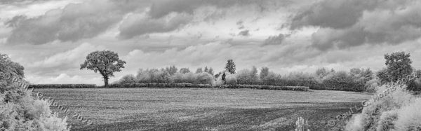
Then we have the equivalent infra-red views:
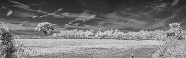
With a side-by-side (before/after) comparison:
Finally, this comparison shows the recent colour and infra-red version side-by-side:
Some technical notes:
The colour images are from my Fuji camera and the black and white images are from my infra-red converted Sony camera.
Because modern lenses, in general, can be problematic with infra-red I use an old Takumar 55mm lens for the infra-red and the colour image. The problems seems to be caused by the type of glass used in modern lenses; perhaps this explains why many modern lenses don’t have IR focussing marks.
The reason I use the Takumar lens on my Fuji camera is that the panorama stitching software has to ‘distort’ the sides of the images to blend them together and different lenses get distorted in different ways. This makes good alignment difficult, if not impossible. This also happens to an extent with single, unstitched, images.